Partial Dependence Plots
December 23, 2014It can be difficult to understand the functional relations between predictors and an outcome when using black box prediction methods like random forests. One way to investigate these relations is with partial dependence plots. These plots are graphical visualizations of the marginal effect of a given variable (or multiple variables) on an outcome. Typically, these are restricted to only one or two variables due to the limits of human perception, and thus may be misleading due to hidden higher-order interactions. Despite this, partial dependence plots can still be extremely useful for knowledge discovery in large data sets, especially when the random forest is dominated by lower-order interactions and main effects.
Following the notation of Hastie et al. (2009) in The Elements of Statistical Learning, partial dependence plots can be mathematically defined as follows. Suppose is a subset of predictor variables, such that . Let be a complement to , such that . The random forest predictor function, , will depend upon all predictor variables. Thus, . The partial dependence of the predictors on the predictive function is
and can be estimated by
where are the values of ocurring over all observations in the training data. In other words, in order to calculate the partial dependence of a given variable (or variables), the entire training set must be utilized for every set of joint values in . As one can image, this can be quite computationally expensive when the data set becomes large.
I have not had much luck finding a nice implementation of partial dependence plots for two predictors in R. The plotting function included in the randomForest package, for example, is limited to one variable. This is most likely due to the computation time required for plots including two variables. Because the data set needs to be repeated over the entire grid of hypothetical values, two variable plots can easily get out of hand with only a few thousand observations.
One nice example is the plotmo package, which is a so-called “poor man’s” partial dependence plot. Essentially instead of averaging over the entire data set, it will just take the median value of all continuous predictors and the first level for all factors (as the default). While it does not create a true partial dependence plot, it blows traditional partial dependence plots out of the water in terms of speed.
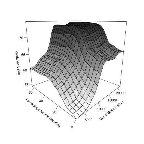
Still, I wrote up a simple script, seen below, to get two-dimensional partial dependence plots. In this example, I’m using the College data set found in the ISLR package, which examines the relation between graduation rates and various statistics for US Colleges (N = 777) from the 1995 issue of US News and World Report. It contains 17 variables that can be used as predictors for graduation rate, such as whether a university is private or public, the acceptance rate, and the out-of-state tuition cost. For this example, I’m using the two variables that had the highest variable importance values: out-of-state tuition and percentage of alumni donating. Note that I am just treating the entire data set as the training set for simplicity.
library(ISLR)
library(randomForest)
library(dplyr)

# set seed for reproducibility
set.seed(42)

data(College)

rf <- randomForest(Grad.Rate ~ ., data = College)
# varImpPlot(rf)

var1_vals <- seq(from = min(College$Outstate),
                 to = max(College$Outstate),
                 by = (max(College$Outstate) -
                         min(College$Outstate))/19)

var2_vals <- seq(from = min(College$perc.alumni),
                 to = max(College$perc.alumni),
                 by = (max(College$perc.alumni) -
                         min(College$perc.alumni))/19)

# Create a 20x20 grid
two_vals <- expand.grid(var1_vals, var2_vals)
two_vals <- arrange(two_vals, Var1, Var2)

two_rep <- College[rep(1:nrow(College), nrow(two_vals)), ]

two_rep$Outstate <- rep(two_vals$Var1, each = nrow(College))
two_rep$perc.alumni <- rep(two_vals$Var2, each = nrow(College))

two_pred <- predict(rf, two_rep)
two_rep$pred <- two_pred

two_agg <- group_by(two_rep, Outstate, perc.alumni) %>%
  summarise(mean_pred = mean(pred))

z <- matrix(two_agg$mean_pred, nrow = length(var1_vals), byrow = TRUE)

# Set color range (using grayscale)
jet.colors <- colorRampPalette( c("#ffffff", "#2a2a2a") )

# Generate the desired number of colors from this palette
nbcol <- 100
color <- jet.colors(nbcol)

# Compute the z-value at the facet centers
zfacet <- z[-1, -1] +
  z[-1, -1 * length(var1_vals)] +
  z[-1 * length(var2_vals), -1] +
  z[-1 * length(var1_vals), -1 * length(var2_vals)]

# Recode facet z-values into color indices
facetcol <- cut(zfacet, nbcol)

# Use persp for 3D plotting
persp(x = var1_vals, y = var2_vals, z = z, theta = -45,
      xlab = "\nOut of State Tuition",
      ylab = "\nPercentage Alumni Donating",
      zlab = "\nPredicted Value",
      cex.lab = 1,
      ticktype = "detailed",
      col = color[facetcol])
Again, this figure shows the partial dependence plot between both out-of-state tuition and percent of alumni donating to the institution, resulting in a three-dimensional plot. Both variables have positive relationships with the outcome, such that increased values in each variable correspond to an increase in the predicted graduation rate of a particular institution. Note that because both variables have consistent relations with predicted graduation rate across the values of the other variable, there is no substantial evidence for an interaction.
Like I said before, the following code can be slow. The bottleneck for this implementation (which mirrors the partial dependence plot in the randomForest package) is with the predict function across the replicate data sets, which takes about 30 seconds on my machine. A more efficient method to perform these plots does exist, and is known as a weighted tree traversal. More information regarding this implementation can be found at the bottom of this page, which outlines the procedure in scikit-learn for gradient boosted models.
