Visualizing Implicit Racial Bias
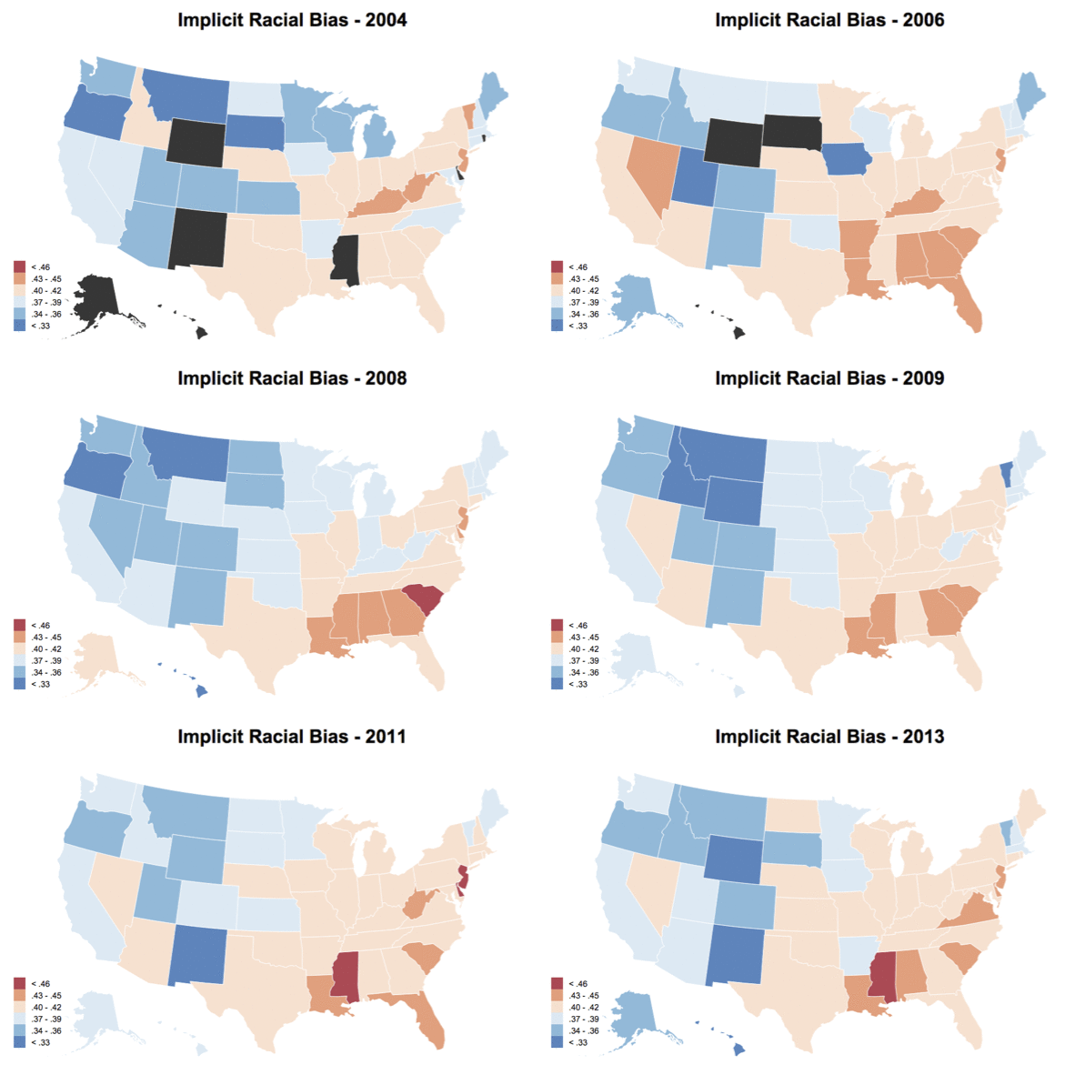
March 14, 2015For this project, I was looking to get more experience with D3.js and choropleths (I just find them to be fun visualization tools). Luckily, Project Implicit recently uploaded data from a few million participants they have been collecting over the past 10 years on a variety of different Implicit Association Tests (IATs), some of which have state and county information of those taking the test.
For those of you who don’t know, the IAT (as defined on the project implicit website) is a measure of “the strength of associations between concepts (e.g., black people, gay people) and evaluations (e.g., good, bad) or stereotypes (e.g., athletic, clumsy).” In the case of the racial bias IAT, for example, participants are asked to sort words and pictures into stereotype congruent pairings (i.e., white and good; black and bad) or stereotype incongruent pairings (white and bad; black and good). The main idea is that sorting is much easier for the congruent pairing condition when compared to the incongruent pairing condition. Thus, taking the difference in reaction times for these two conditions for a given participant can create a measure of implicit bias. Note that this explanation is a simplification of the actual pre-processing algorithm used, known as the D-score.
Anyway, Project Implicit is a website where individuals can take many different IATs to measure various implicit thoughts and biases. I highly recommend checking it out to see what taking an IAT is like and contributing to the project. For this visualization, I will be using the racial bias IAT, which by far has the most participants in the available data sets (and are available for download on their Open Science Framework project page.
After creating an R script to download the files off the web and clean them, I went ahead and created the visualization. Note that I required a sample size of at least 100 for each state for the state-level visualization, and at least 30 for each county for the county-level visualization. I also restricted the sample to those who reported living in a U.S. state (i.e., no armed forces or U.S. territories), reported their race as white, and also reported their state and county information. This left a sample size of 1,206,827. Not too shabby!
You can see the visualization for state-level IAT scores from 2004 - 2013 here. You can also find the county-level plot as well, but it has a much more limiting sample size. Additionally, see below for a gif of how the choropleth changes across years. Not much of a conclusion can be made given the smaller sample size and the fact that samples are changing within each year, but it was fun putting together nonetheless. As always, the code and data for these visualizations can be found on GitHub.

